W Magazine
| 3 minutes read
Condé Nast / W Magazine Responsive Homepage
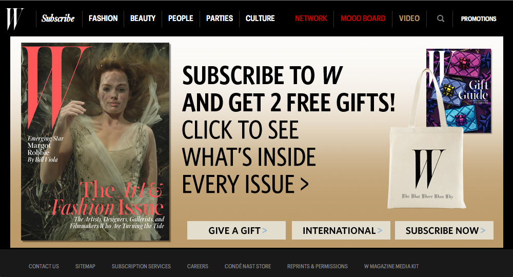
This project was commissioned by Condé Nast at a moment when editorial power was shifting rapidly from print to digital. W Magazine was already an icon. Visually daring, culturally sharp, unapologetically fashion-forward. The challenge was not to reinvent W, but to translate its editorial authority and attitude into a responsive digital homepage without diluting what made it unmistakably W. ShopAI was tasked with designing the responsive homepage experience for W Magazine, ensuring it could live across devices while preserving the magazine’s bold visual language, cultural relevance, and editorial hierarchy. This was not a layout exercise. It was an act of editorial translation.
The Emotional Starting Point
W Magazine has always been about provocation and presence. It doesn’t whisper. It commands attention. In print, that power comes from scale, photography, typography, and daring composition. The emotional question behind this project was simple and difficult at the same time: How does a magazine that thrives on boldness keep its edge when the canvas becomes fluid, scrollable, and fragmented? The answer wasn’t to tame the brand for the web. It was to let the web bend around the brand.
Respecting Editorial Hierarchy
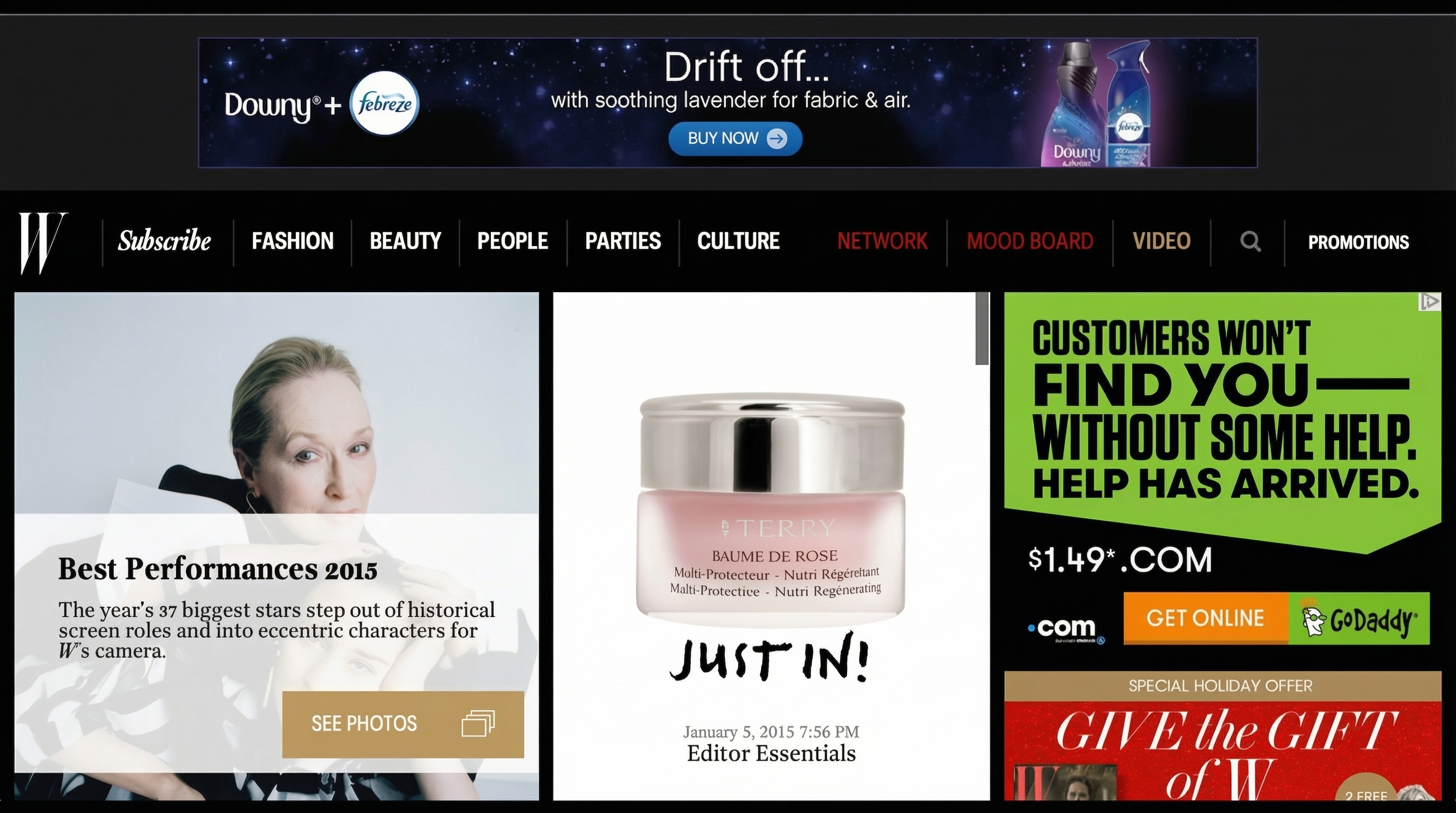
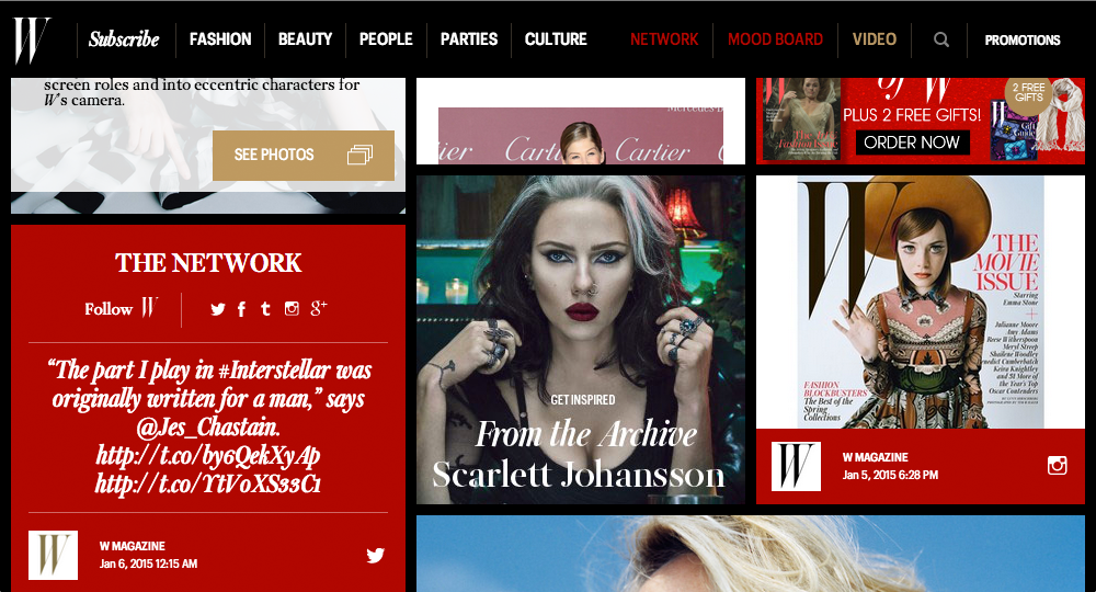
At the heart of W is curation. Not everything is equal. Some stories demand dominance. Others support, contextualize, or extend the narrative. The homepage design leaned heavily into this idea. Visual hierarchy was treated as editorial voice. Large imagery signaled cultural importance. Typography carried confidence. Spacing created rhythm and pause. Scrolling the homepage was designed to feel like moving through a curated exhibition rather than browsing a feed. The experience encouraged discovery without flattening significance.
Designing for Responsiveness Without Dilution
Responsiveness was approached as choreography, not compression. Instead of shrinking content mechanically, the layout reflowed with intention. Stories rearranged themselves, but their weight remained intact. Headlines kept their authority. Images retained their drama. On smaller screens, the experience became more intimate, more cinematic. On larger displays, it felt expansive and commanding. The design adapted without ever apologizing for itself.
Fashion, Culture, and Commerce in Balance
W Magazine lives at the intersection of fashion, celebrity, art, and culture. The homepage needed to hold that complexity without becoming chaotic. Fashion editorials sat confidently alongside cultural features and celebrity profiles. Promotional content and subscriptions were integrated carefully, present but never disruptive. The design respected the reader’s intelligence. Nothing blinked. Nothing begged. Everything belonged.
Visual Language and Atmosphere
The visual system leaned into contrast. Deep blacks, strong whites, rich imagery, and assertive typography reinforced W’s signature mood. Photography was never treated as decoration. It was the main character. Faces looked back at the reader. Fashion posed with intention. Art felt confrontational when it needed to be. The homepage didn’t just show content. It set a tone.
Social and Network Presence
The design acknowledged that W existed within a broader cultural ecosystem. Social signals, archive references, and network touchpoints were woven into the experience without overpowering it. The homepage felt alive, current, and connected, while still rooted in editorial depth rather than algorithmic urgency.
The Lasting Impression
What users experienced wasn’t just a homepage. It was an editorial stance translated into motion and interaction. They didn’t feel like they were browsing content. They felt like they were entering W’s world. The design preserved what mattered most: confidence, taste, and cultural authority. It proved that responsiveness doesn’t have to mean compromise.
Why This Matters
Editorial brands lose power when they treat digital as a downgrade from print. This project showed the opposite. Digital can be a stage, not a concession. By designing with respect for hierarchy, emotion, and identity, the W Magazine homepage became a living extension of the brand rather than a diluted mirror. At ShopAI, we design digital experiences that protect what makes brands iconic while helping them evolve with intention.