
Lumary Rebranding
| 4 minutes read
Lumary Rebranding Transformation: Designing a Human-Centered Identity for Modern Healthcare Platforms
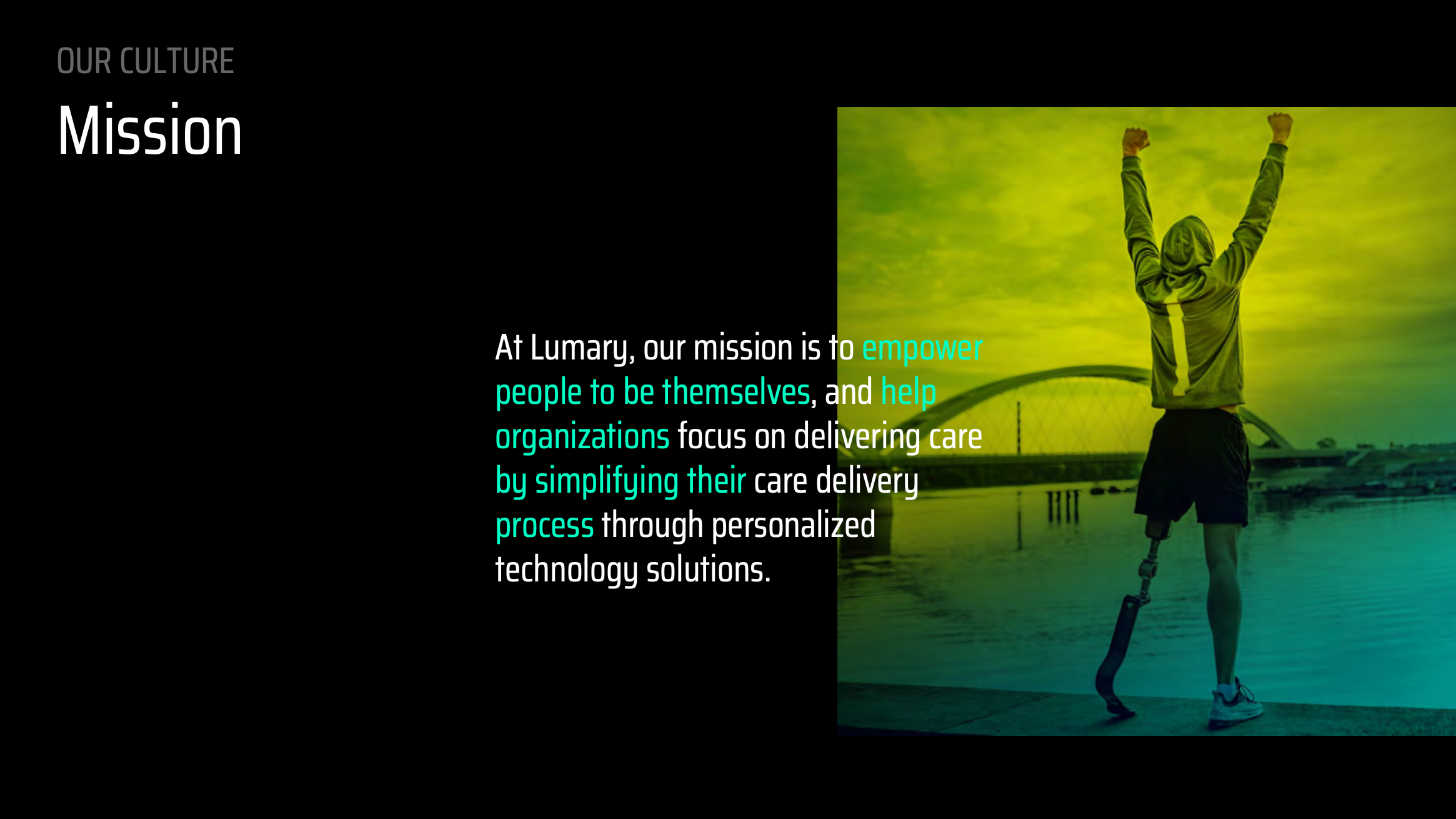
Lumary is a healthcare technology company focused on simplifying care delivery while enabling better outcomes for providers, caregivers, and administrators. As Lumary expanded globally and matured as a platform, its existing brand no longer reflected the depth, ambition, or human-centered philosophy of its products. ShopAI partnered with Lumary to lead a full brand transformation—one grounded in clarity, empathy, and system-level thinking. The result was a scalable brand system designed to feel intuitive, credible, and deeply human across product, marketing, and internal communications. This case study outlines the thinking and process behind Lumary’s rebrand, drawing directly from the official Lumary US Brand Guide.
The Challenge
Lumary’s internal and external audits surfaced several core issues:
- Messaging was overly technical and technology-first
- Tone and voice were inconsistent across teams and regions
- The visual identity felt dated and lacked clear meaning
- The brand did not clearly communicate Lumary’s expertise or global ambition
- The healthcare mission was present, but emotionally distant
At the same time, Lumary had strong foundations:
- A deeply human mission
- A diverse, values-driven culture
- Powerful healthcare outcomes delivered through its platform
The challenge was to realign brand perception with product reality.
Strategic Insight: What We See Is Not What Is
The conceptual foundation of the rebrand came from a powerful insight, inspired by quantum mechanics and reframed for healthcare:
“In healthcare, what we see is different than what really is.”
Rather than treating healthcare as a surface-level system of workflows and compliance, Lumary takes an ontological approach—understanding care at its deepest level, then designing technology around real human needs.
This idea became the philosophical backbone of the brand.
Process
1. Brand Reframing: From Technology to Outcomes
The first step was redefining Lumary’s brand narrative:
- Shifted messaging away from tools and features
- Centered the brand on care delivery, empathy, and outcomes
- Clarified the core promise:
Simplifying Care Delivery, Enabling Better Outcomes
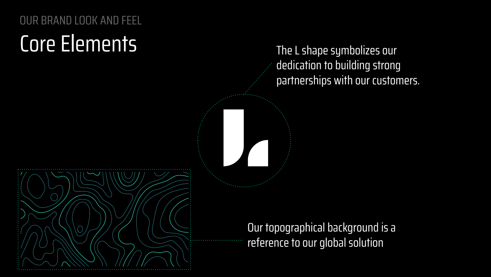
2. Visual System: Particles, Flow, and Continuum
Lumary’s visual identity was rebuilt as a system, not a logo-first exercise.
Key elements included:
- Topographical backgrounds representing global scale, complexity, and continuity
- Flowing, organic shapes inspired by particles and movement
- A dark, modern canvas designed to reduce visual fatigue in healthcare environments
The system reinforces the idea that care is not linear—it’s dynamic, interconnected, and constantly evolving.
3. Color and Accessibility
Color was treated as both an emotional and functional tool:
- A vibrant yet accessible palette to support inclusivity
- High-contrast combinations for readability and ADA considerations
- A dark UI foundation to reduce eye strain for long sessions
This ensured the brand felt energetic without overwhelming users in high-stakes healthcare contexts.
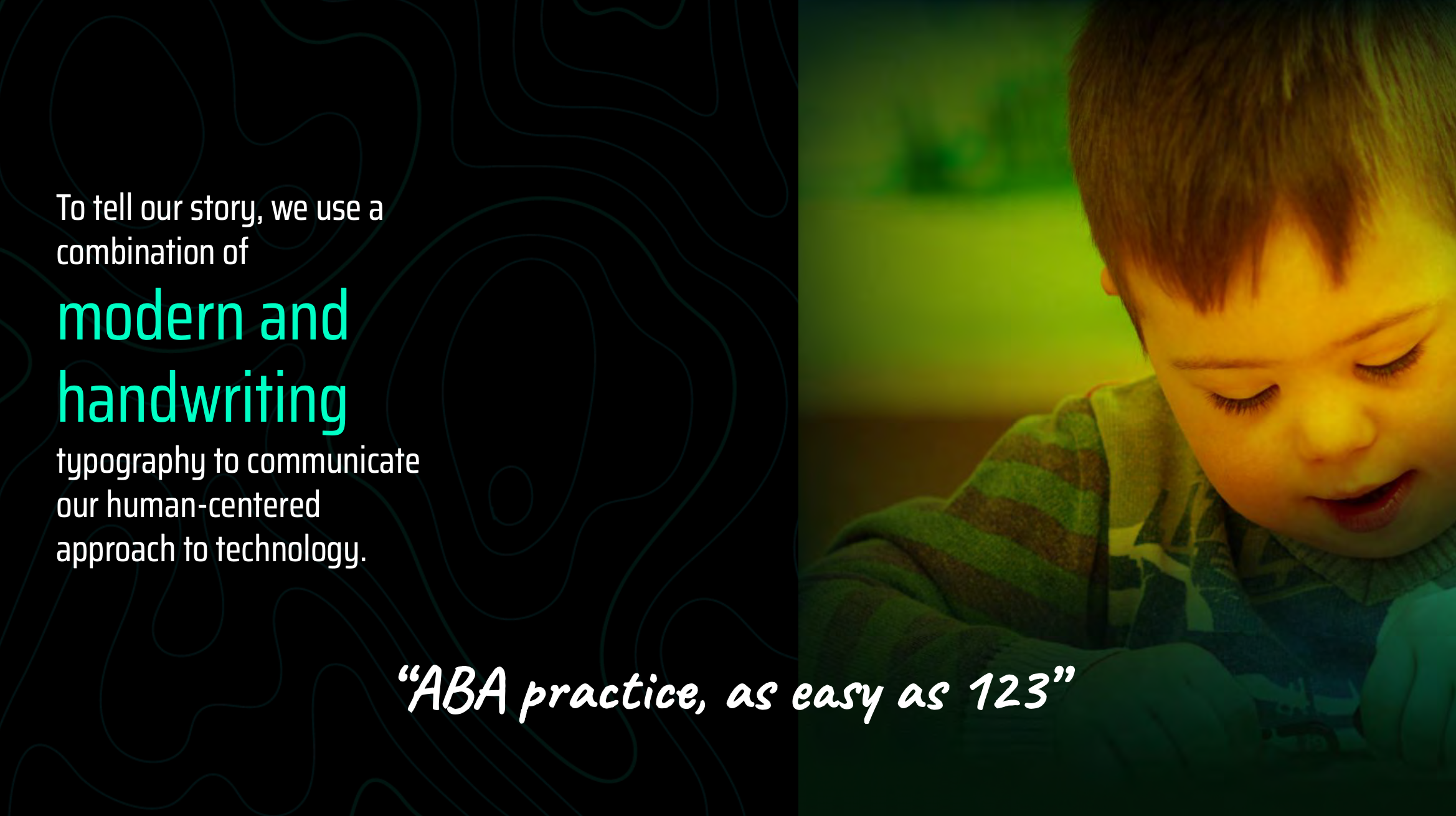
4. Typography: Precision Meets Humanity
Typography played a critical role in balancing credibility and warmth:
- Saira Condensed for clarity, structure, and authority
- Caveat handwriting style to signal humanity and approachability
This dual-typography system allowed Lumary to speak with confidence while remaining deeply human.
5. Tone and Voice: Empathy First
The new Lumary voice was designed to feel:
- Natural
- Transparent
- Respectful of lived experience
Audience-specific guidance was created for:
- End users and caregivers
- Administrators and providers
- Internal teams
Across all contexts, the rule was simple:
Empathize first. Explain second.
6. Product and Brand Alignment
Unlike traditional brand projects, Lumary’s identity was designed to live directly inside the product experience.
The system was applied consistently across:
- Product UI and workflows
- Marketing and sales materials
- Internal communications and culture artifacts
This ensured that Lumary’s brand promise was experienced—not just stated.
Outcome
The Lumary rebrand delivered:
- A modern, globally scalable brand system
- Clear, human-centered messaging aligned with real healthcare outcomes
- A flexible visual language that adapts across products and regions
- Stronger credibility with enterprise partners and investors
Most importantly, the brand now reflects what Lumary actually does:
empower people and simplify care.
Why This Matters
Healthcare technology brands cannot afford abstraction for abstraction’s sake.
This project reflects ShopAI’s approach to brand work:
- Brand as infrastructure, not decoration
- Systems over symbols
- Empathy grounded in real user contexts