Castlight Rebrand
| 3 minutes read
Unifying Two Products Into One Scalable Brand System
When Castlight Health acquired Jiff, the challenge extended far beyond product integration. Two mature platforms with distinct identities needed to merge into a single, cohesive brand—without losing trust, recognition, or momentum. ShopAI partnered with Castlight to design a new brand identity that respected both legacies while creating a future-ready visual system. The outcome was the new Castlight “C” logo: a modular, geometric mark designed to scale across products, platforms, and motion. This case study outlines the branding process behind that transformation.
The Challenge
Castlight and Jiff each brought strong but different brand qualities:
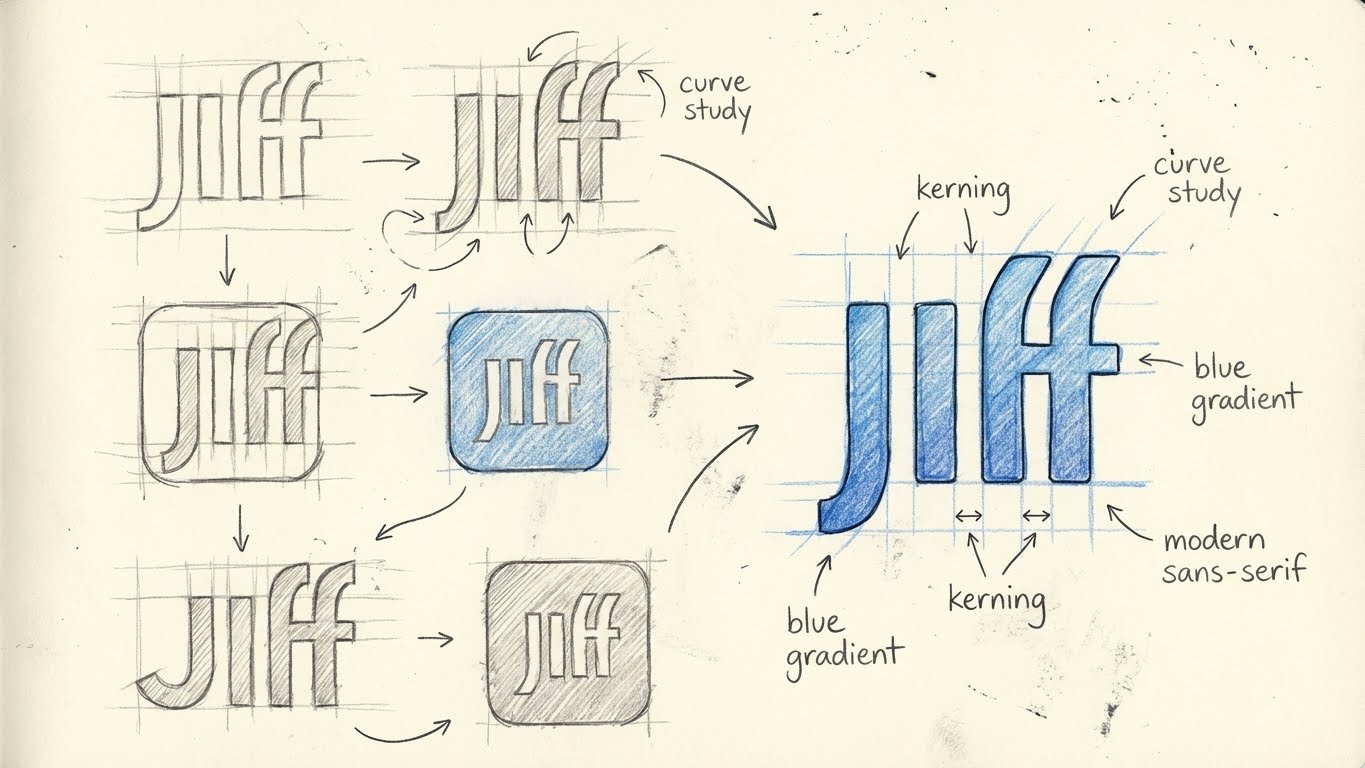
- Jiff: Modern, app-first, engagement-driven
- Castlight: Established, trusted, enterprise-focused
Key constraints:
- Preserve brand equity from both products
- Design for enterprise credibility and modern UX
- Create a logo that functions as a system, not a static mark
Strategic Insight: Geometry as Common Ground
Rather than forcing a symbolic metaphor, we identified geometry as the shared visual language between the two brands.
- Jiff’s logo emphasized modularity and motion
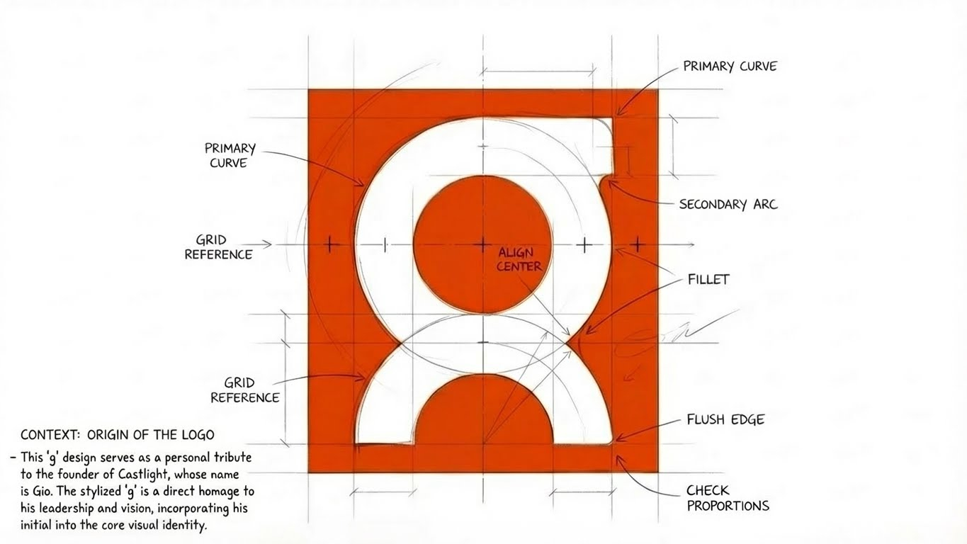
- Castlight’s legacy “g” relied on strong circular structure
The circle became the foundation for the new identity—neutral, scalable, and structurally sound.
Process
1. Deconstruction
Both logos were stripped down to their core components:
- Stroke weight
- Angular rhythm
- Negative space
- Radial balance
Removing color and brand context allowed us to compare the marks purely as forms. This revealed natural alignment within a shared geometric framework.
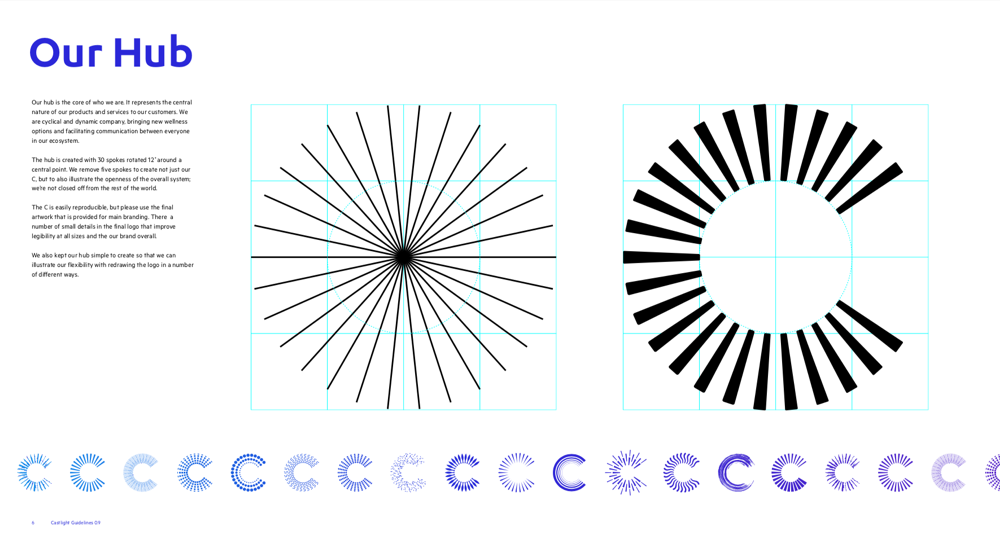
2. Construction of the New “C”
The new Castlight “C” was built using a radial grid system composed of repeating segments.
This approach:
- Preserved Castlight’s circular heritage
- Incorporated Jiff’s modular, dynamic energy
- Allowed precise control over proportion and rhythm
The result was a letterform that functions as both a logo and a visual engine.
3. Designing for Flexibility
A core principle of the rebrand was non-finality.
The logo was intentionally designed to be:
- Reconfigurable
- Reproducible
- Adaptable across contexts
This enabled:
- Product-specific logo variations
- Seamless animation in UI and motion design
- Consistent application across marketing, product, and internal tools
The key shift was moving from “what the logo looks like” to “what the logo can do.”
4. Product-First Validation
Because ShopAI works across branding, UX, and prototyping, the identity was validated inside real product workflows—not just static brand decks.
The new brand system was tested in:
- Product UI and dashboards
- Demo environments and sales tooling
- Onboarding and motion sequences
This ensured immediate alignment between brand, product, and go-to-market teams.
Outcome
The final Castlight identity achieved three critical outcomes:
- Unified Castlight and Jiff under a single, coherent system
- Preserved trust while introducing modern flexibility
- Created a scalable brand framework ready for future growth
The new “C” is not a static endpoint, but a living system designed to evolve alongside the platform.
Why This Matters
In modern SaaS and health tech organizations, branding is infrastructure.
This project reflects ShopAI’s approach to brand work:
- Systems over symbols
- Flexibility over rigidity
- Product reality over brand theory