A Logo-Driven Website
| 4 minutes read
A Logo-Driven Website Redesign for a Modern Recruiting Platform
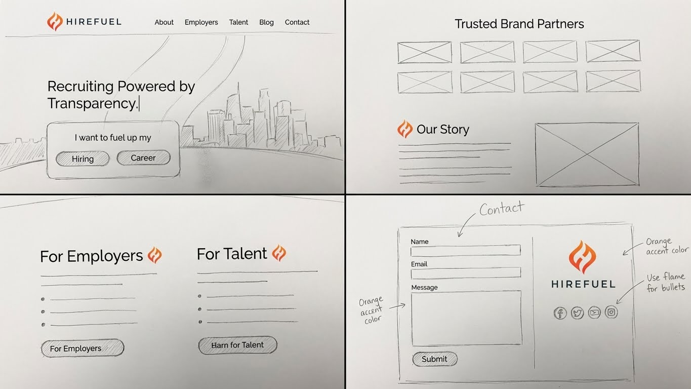
Hirefuel is a recruiting and talent engagement platform designed to help teams attract, nurture, and convert candidates more effectively. While the product itself was powerful, the existing website did not fully communicate its value, energy, or differentiation. The redesign focused on transforming the site into a clear, confident, and visually distinctive experience—one that reflects Hirefuel’s personality and purpose at first glance. The guiding constraint was intentional and bold: everything would be inspired by the Hirefuel logo.
The Challenge
Hirefuel’s brand already had a strong foundation, but the website lacked cohesion. Messaging, layout, and visual rhythm felt disconnected from the brand’s identity, making it harder for visitors to quickly understand what the platform does and why it stands out in a crowded recruiting market. The key challenges were:
- Translate the logo’s personality into a full digital system
- Create a modern, energetic site without overwhelming users
- Clarify the product value for recruiters, founders, and hiring teams
- Improve storytelling while supporting lead generation
This wasn’t just a redesign—it was a brand interpretation exercise.
Design Strategy
The logo became the creative anchor for the entire project. Its shapes, curves, spacing, and energy informed everything from layout decisions to motion, hierarchy, and color usage. Key strategic decisions included:
- Using the logo’s geometry to guide grid systems and section breaks
- Echoing its curves and angles in UI elements and illustrations
- Translating brand energy into spacing and rhythm rather than decoration
- Letting the logo influence tone without becoming repetitive
The goal was to make the site feel like the logo came to life—confident, focused, and modern.
UX & Information Architecture
From a UX perspective, the redesign focused on clarity and flow. Visitors needed to understand Hirefuel’s value quickly, without reading dense copy or navigating complex pages. Key UX improvements included:
- A simplified homepage narrative that moves from problem to solution
- Clear segmentation for different audiences such as recruiters and teams
- Scannable sections with strong visual anchors
- Streamlined calls-to-action that guide users toward demos and contact
Visual Design System
The visual system was intentionally restrained but expressive. Rather than introducing new motifs, the design amplified what was already present in the brand. Highlights included:
- A refined color palette derived directly from the logo
- Bold typography choices that reinforce confidence and clarity
- Consistent use of whitespace to let content breathe
- Subtle visual accents that echo the logo’s form language
This approach ensured the site felt cohesive, intentional, and unmistakably Hirefuel.
Content & Messaging
The copy was refined to match the visual confidence of the redesign. Messaging shifted from feature-heavy explanations to outcome-driven storytelling—focusing on how Hirefuel helps teams hire better, faster, and with less friction. Headlines were designed to be direct and approachable, while supporting copy provided just enough depth to build trust without slowing users down.
Results & Impact
The redesigned Hirefuel site presents the platform as modern, credible, and purpose-built for today’s hiring challenges. By grounding every design decision in the logo, the site achieves a rare balance: visually distinctive without being distracting, and expressive without losing clarity. The result is a website that:
- Strengthens brand recognition
- Communicates value faster
- Supports demos and sales conversations
- Scales visually as the product evolves
Why This Matters for SaaS Websites
For SaaS companies, a website is often the first product experience. Hirefuel’s redesign shows how a strong brand asset—when used thoughtfully—can guide an entire digital system. Instead of adding complexity, constraints like logo-led design can create focus, consistency, and memorability.
Designing Brand-Led Digital Experiences with ShopAI
At ShopAI, we help teams turn existing brand signals into full digital experiences—whether that means a site redesign, a sales demo, or a product prototype. By grounding design in what already makes a company unique, we help platforms communicate faster, clearer, and with more confidence. If your product has a strong identity but your website doesn’t reflect it yet, we help bridge that gap—thoughtfully, strategically, and human-first.