Unload Your 401(k)
| 3 minutes read
Unload Your 401(k) Advocacy Campaign: When Personal Finance Became a Moral Question
This campaign confronted people with an uncomfortable truth hiding in plain sight: many retirement plans are quietly invested in gun manufacturers. Not through choice, but through default. Through distance. Through silence. The campaign asked a single, unsettling question:
How much of this is yours? ShopAI contributed to the campaign by helping design and build the website experience that became the campaign’s emotional and functional core. The site wasn’t meant to persuade with volume or outrage. It was designed to create a pause. A moment of realization. A space where curiosity could turn into accountability.
The Emotional Starting Point
Money is abstract. Retirement funds even more so. Most people never see where their savings go. That distance creates comfort, but it also creates complicity. This campaign collapsed that distance. By framing retirement investment through the language of ownership and consequence, the message landed personally. This wasn’t about politics in the abstract. It was about your future being tied to something you may not believe in. The emotional entry point wasn’t fear. It was awareness.
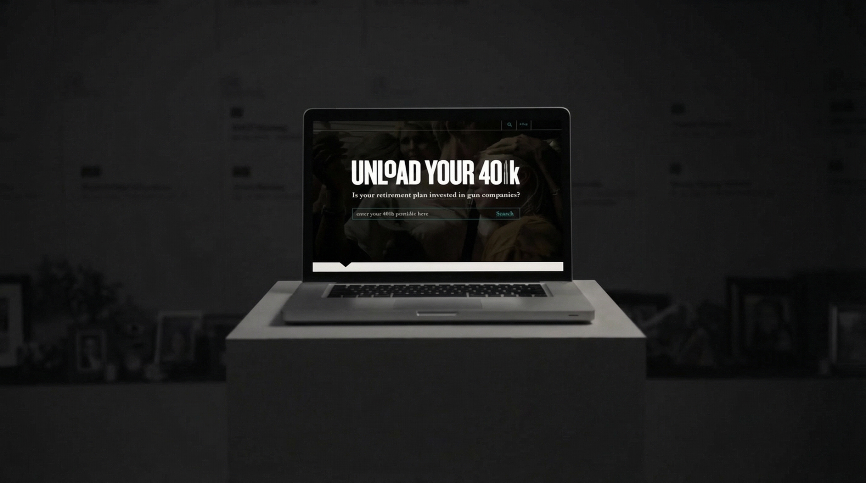
Entering the Experience
The landing experience was stark and restrained. A laptop on a pedestal. A darkened environment. One dominant line of copy:
Below it, a simple question asked without judgment: Is your retirement plan invested in gun companies? The design avoided spectacle. No imagery of violence. No sensationalism. Just a quiet confrontation between the user and their own financial footprint. The absence of noise made the message louder.
Interaction as Revelation
The core interaction invited users to enter their 401(k) provider and search. That act alone shifted the relationship. This was no longer a passive message. It required participation. Typing a provider name became an emotional threshold. A moment of hesitation. A moment of agency. The interface was intentionally minimal, allowing the weight of the action to sit with the user. The experience didn’t accuse. It revealed. Discovery became the turning point.
Tone and Visual Language
The visual system leaned into darkness, contrast, and restraint. The color palette was muted. Typography was assertive but not aggressive. Every design decision was made to support seriousness without dramatization. The background imagery suggested crowds and movement, but never overtly. It hinted at collective impact without showing explicit harm. This allowed users to project their own understanding onto the experience. The tone was sober, direct, and human.
The Role of the Website
The website was not just an information hub. It was the campaign itself. It functioned as:
- A moment of truth
- A tool for self-examination
- A bridge between awareness and action
ShopAI’s role was to ensure the experience felt credible, calm, and trustworthy. The site had to feel like a place where difficult information could be handled responsibly. No pop-ups. No distractions. Just focus.
The Lasting Impression
What stayed with users wasn’t a statistic. It was a feeling. A realization that inaction is still a form of participation. That financial systems don’t exist outside personal values. That distance doesn’t absolve responsibility. The campaign didn’t tell people what to do next. It gave them the clarity to decide for themselves.
Why This Matters
Advocacy campaigns often struggle between being loud and being effective. This project chose effectiveness. By centering the experience on personal discovery rather than external blame, the campaign respected the user’s intelligence and autonomy. It trusted that once people see clearly, they will act intentionally. At ShopAI, we believe the most powerful digital experiences don’t overwhelm. They illuminate. This campaign proved that sometimes the strongest call to action is simply helping people see what was hidden all along.